
In the previous few blog posts, we’ve seen all the popular forecast measures used in practice. But all of them were really focused on smooth and steady time series. But there is a whole different breed of time series in real life – intermittent and lumpy demand.

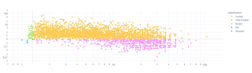
Casually, we call intermittent series as series with a lot of periods with no demand, i.e. sporadic demand. Syntetos and Boylan(2005) proposed a more formal way of categorizing time series. They used wo parameters of the time series for this classification – Average Demand Interval and Square of Coefficient of Variation.
Average Demand Interval is the average interval in time periods between two non-zero demand. i.e. if the ADI for a time series is 1.9, it means that on an average we see a non-zero demand every 1.9 time periods.

ADI is a measure of intermittency; the higher it is, the ore intermittent the series is.
Coefficient of Variation is the standardized standard deviation. We calculate the standard deviation, but then scale it with the mean of the series to guard against scale dependency.

This shows the variability of a time series. If 
Based on these two demand characteristics, Syntetos and Boylan has theoretically derived cutoff values which defines a marked change in the type of behaviour. They have defined intermittency cutoff as 1.32 and

The Forecast measures we have discussed was all, predominantly, designed to handle Smooth and Erratic timeseries. But in the real world, there are a lot more Intermittent and Lumpy timeseries. Typical examples are Spare Parts sales, Long tail of Retail Sales, etc.
Unsuitability of Traditional Error Measures
The single defining characteristic of Intermittent and Lumpy series are the number of times there are zero demand. And this wreaks havoc with a lot of the measures we have seen so far. All the percent errors(for eg. MAPE) become unstable because of the division by zero, which now is an almost certainty. Similarly, the Relative Errors(for eg. MRAE), where we use a reference forecast to scale the errors, also becomes unstable, especially when using Naïve Forecast as a reference. This happens because there would be multiple periods with zero demand, and that would create zero reference error and hence undefined.
sMAPE is designed against this division with zero, but even there sMAPE has problems when the number of zero demands increase. And we know from our previous explorations that sMAPE has problems when either forecast is much higher than actuals or vice versa. And in case of intermittent demand, such cases are galore. If there is zero demand and we have forecasted something, or the other way around, we have such a situation. For eg. for a zero demand, one method forecasts 1 and another forecasts 10, the outcome is 200% regardless.
New and Recommended Error Measures
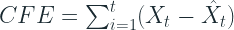
Cumulative Forecast Error (CFE, CFE Min, CFE Max)
We have already seen Cumulative Forecast Error( a.k.a. Forecast Bias) earlier. It is just the signed error over the entire horizon, so that the negative and positive errors cancel out each other. This has direct implications to over or under stocking in a Supply Chain. Peter Wallstrom[1] also advocates the use of CFE Max and CFE Min. A CFE of zero can happen because of chance as well and over a large horizon, we miss out on a lot of detail in between. so he proposes to look at CFE in conjunction with CFE Max and CFE Min, which are the maximum and the minimum values of CFE in the horizon.
![CFE_{min} = min_{t \epsilon [1,2,...T]} CFE_t](https://s0.wp.com/latex.php?latex=CFE_%7Bmin%7D+%3D+min_%7Bt+%5Cepsilon+%5B1%2C2%2C...T%5D%7D+CFE_t+&bg=ffffff&fg=192930&s=2&c=20201002)
![CFE_{max} = max_{t \epsilon [1,2,...T]} CFE_t](https://s0.wp.com/latex.php?latex=CFE_%7Bmax%7D+%3D+max_%7Bt+%5Cepsilon+%5B1%2C2%2C...T%5D%7D+CFE_t+&bg=ffffff&fg=192930&s=2&c=20201002)
Percent Better(PBMAE, PBRMSE, etc.)
We have already seen Percent Better. This is also a pretty decent measure to use for Intermittent demand. This does not have the problem of numerical instability and is defined everywhere. But it does not measure the magnitude of errors, rather than the count of errors.
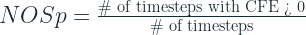
Number of Shortages (NOS and NOSp)
Generally, to trace whether a forecast is biased or not, we use tracking signal(which is CFE/MAD). But the limits that are set to trigger warnings(+/- 4) is derived on the assumption that the demand is normally distributed. In the case of intermittent demand, it is not normally distributed and because of that this trigger calls out a lot of false positives.
Another alternative to this is the Number of Shortages measure, more commonly represented as Percentage of Number of Shortages. It just counts the number of instances where the cumulative forecast error was greater than zero, resulting in a shortage. A very high number or a low number indicated bias in either direction.
Periods in Stock (PIS)
NOS does not identify systematic errors because it doesn’t consider the temporal dimension of stock carry over. PIS goes one step ahead and measures the total number of periods the forecasted items has spent in stock or number of stock out periods.
To understand how PIS works, let’s take an example.
Let’s say there is a forecast of one unit every day in a three day horizon. In the beginning of the first period the one item is delivered to the fictitious stock (this is a simplification compared to reality). If there has been no demand during the first day, the result is plus one PIS. When a demand occurs, the demand is subtracted from the forecast. A demand of one in period 1 results in zero PIS in period 1 and CFE of -1. If the demand is equal to zero during three periods, PIS in period 3 is equal to plus six. The item from day one has spent three days in stock, the item from the second day have spent two days in stock and the last item has spent one day in stock
Excerpt from Evaluation of Forecasting Techniques and Forecast Errors with a focus on Intermittent Demand
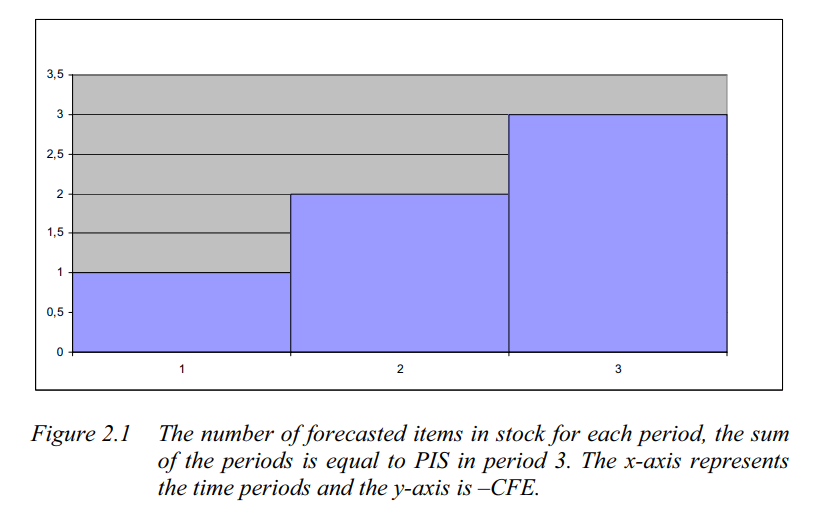
A positive number indicates over forecast and a negative number shows under forecast of demand. It can easily be calculated as the cumulative sum of the CFE, i.e. the area under the bar chart in the diagram

Stock-keeping-oriented Prediction Error Costs(SPEC)
SPEC is a newer metric(Martin et al. 2020[4]) which tries to take the same route as Periods in Stock, but slightly more sophisticated
![SPEC_{\alpha_1 ,\alpha_2} = \frac{1}{n} \sum_{t=1}^n \sum_{i=1}^t\left (max \left [ 0; min \left [ y_i;\sum_{k=1}^i y_k - \sum_{j=1}^t f_j \right ] \cdot \alpha_1;min \left [ f_i;\sum_{k=1}^i f_k - \sum_{j=1}^t y_j \right ] \cdot \alpha_2 \right ] \cdot (t-i+1) \right )](https://s0.wp.com/latex.php?latex=SPEC_%7B%5Calpha_1+%2C%5Calpha_2%7D+%3D+%5Cfrac%7B1%7D%7Bn%7D+%5Csum_%7Bt%3D1%7D%5En+%5Csum_%7Bi%3D1%7D%5Et%5Cleft+%28max+%5Cleft+%5B+0%3B+min+%5Cleft+%5B+y_i%3B%5Csum_%7Bk%3D1%7D%5Ei+y_k+-+%5Csum_%7Bj%3D1%7D%5Et+f_j+%5Cright+%5D+%5Ccdot+%5Calpha_1%3Bmin+%5Cleft+%5B+f_i%3B%5Csum_%7Bk%3D1%7D%5Ei+f_k+-+%5Csum_%7Bj%3D1%7D%5Et+y_j+%5Cright+%5D+%5Ccdot+%5Calpha_2+%5Cright+%5D+%5Ccdot+%28t-i%2B1%29+%5Cright+%29&bg=ffffff&fg=192930&s=2&c=20201002)
Although it looks intimidating at first, we can understand it intuitively. The crux of the calculation is handled by two inner min terms – Opportunity cost and Stock Keeping costs. These are the two costs which we need to balance in a Supply Chain from an inventory management perspective.
The left term measures the opportunity cost which arises from under forecasting. This is the sales which we could have made if there was enough stock. For eg. if the demand was 10 and we only forecasted 5, we have an opportunity loss of 5. Now, let’s suppose we have been forecasting 5 for last three time periods and there were no demand and then a demand of 10 comes in. so we have 15 in stock and we fulfill 10. So here, there is no opportunity cost. And we can also say that an opportunity cost for a time period will not be greater than the demand at that time period. So combining these conditions, we get the first term of the equation, which measures the opportunity cost.
Using the same logic as before, but inverting it, we can derive the similar equation for Stock Keeping costs(where we over forecast). That is taken care by the right term in the equation.
SPEC for a timestep. actually, looks at all the previous timesteps, calculates the opportunity costs and stock keeping costs for each timestep, and adds them up to arrive at a single number. At any timestep, there will either be an opportunity cost or a stock keeping cost, which in turn looks at the cumulative forecast and actuals till that timestep.
And SPEC for a horizon of timeseries forecast is the average across all the timesteps.
Now there are two terms 

One disadvantage of this is the time complexity. We need nested loops to calculate this metric, which makes it slow to compute.
The implementation is available here – https://github.com/DominikMartin/spec_metric
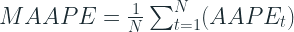
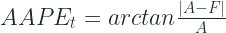
Mean Arctangent Absolute Percent Error (MAAPE)
This is a clever trick on the MAPE formula which avoids one of the main problems with it – undefined at zero. And while addressing this concern, this change also makes it symmetric.
the idea is simple. We know that,
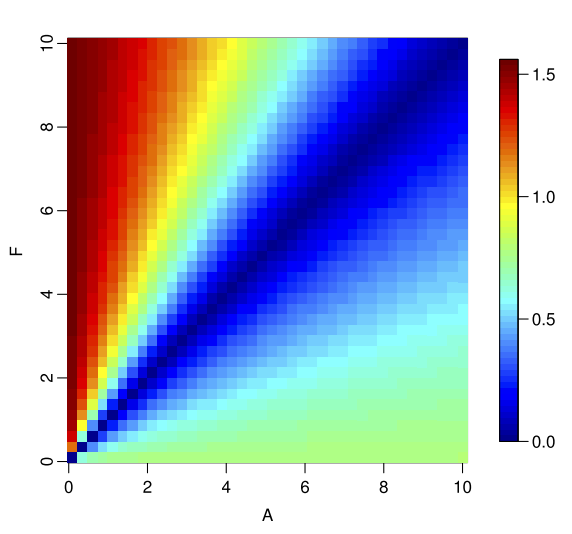
So, if we consider a triangle, with adjacent and opposite sides equal to A and |A-F| respectively, the Absolute Percent Error is nothing by the slope of the hypotenuse.
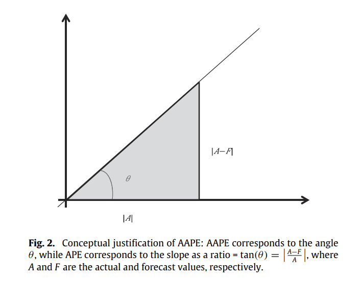
Slope can be measured as a ratio, ranging from 0 to infinity, and also as an angle, ranging from 0 to 90. The slope as a ratio is the traditional Absolute Percent Error that is quite popular. So the paper presents slope as an angle as a stable alternative. Those of you who remember your Trignometry would remember that:
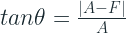
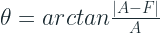
The paper christens it as Arctangent Absolute Percent Error and defines Mean Arctangent Absolute Error as :
where
arctan is defined at all real values from negative infinity to infinity. When 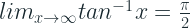
![[0,\infty]](https://s0.wp.com/latex.php?latex=%5B0%2C%5Cinfty%5D&bg=ffffff&fg=192930&s=2&c=20201002)
![[0, \frac{\pi}{2}]](https://s0.wp.com/latex.php?latex=%5B0%2C+%5Cfrac%7B%5Cpi%7D%7B2%7D%5D&bg=ffffff&fg=192930&s=2&c=20201002)
The symmetricity test we saw earlier gives us the below results(from the paper)
We can see that the asymmetry that we saw in APE is not as evident here. The complementary plots that we saw earlier, if we compare AAPE to APE, we see it in a much better shape.
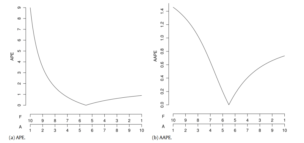
We can see that AAPE still favours under forecasting, but not as much as APE and for that reason might be more useful.
Relative Mean Absolute Error & Relative Mean Squared Error (RelMAE & RelMSE)
There are relative measures which compare the error of the forecast with the error of a reference forecast, in most use cases a naïve forecast or more formally a random walk forecast.
Scaled Error(MASE)
We’ve seen MASE also earlier and know how it’s defined. We scale the error by the average MAE of the reference forecast. Davidenko and Fildes, 2013[3], have shows that the MASE is nothing but a weighted mean of Relative MAE, the weights being the number of error terms. This means that include both MASE and RelMAE may be redundant. But let’s check them out anyways.
Experiment
Let’s pick a real dataset, run ARIMA, ETS, and Crostons, with Zero Forecast as a baseline and calculate all these measures(using GluonTS).
Dataset
I’ve chosen the Retail Dataset from UCI Machine Learning Repository. It is a transnational data set which contains all the transactions occurring between 01/12/2010 and 09/12/2011 for a UK-based and registered non-store online retail. The company mainly sells unique all-occasion gifts. Many customers of the company are wholesalers.
Columns:
- InvoiceNo: Invoice number. Nominal, a 6-digit integral number uniquely assigned to each transaction. If this code starts with letter ‘c’, it indicates a cancellation.
- StockCode: Product (item) code. Nominal, a 5-digit integral number uniquely assigned to each distinct product.
- Description: Product (item) name. Nominal.
- Quantity: The quantities of each product (item) per transaction. Numeric.
- InvoiceDate: Invice Date and time. Numeric, the day and time when each transaction was generated.
- UnitPrice: Unit price. Numeric, Product price per unit in sterling.
- CustomerID: Customer number. Nominal, a 5-digit integral number uniquely assigned to each customer.
- Country: Country name. Nominal, the name of the country where each customer resides.
Preprocessing:
- Group by at StockCode, Country, InvoiceDate –> Sum of Quantity, and Mean of UnitPrice
- Filled in zeros to make timeseries continuous
- Clip lower value of Quantity to 0(removing negatives)
- Took only Time series which had length greater than 52 days.
- Train Test Split Date: 2011-11-01
Stats:
- # of Timeseries: 3828. After filtering: 3671
- Quantity: Mean = 3.76, Max = 12540, Min = 0, Median = 0
- Heavily Skewed towards zero
Time Series Segmentation
Using the same segmentation – Intermittent, Lumpy, Smooth and Erratic- we discussed earlier, I’ve divided the dataset into four.
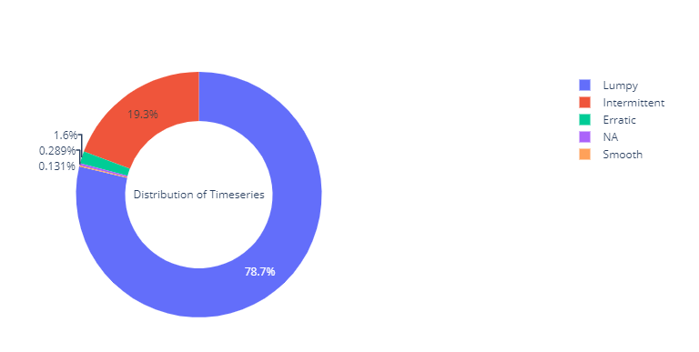
We can see that almost 98% of the timeseries in the dataset are either Intermittent or Lumpy, which is perfect for our use case.
Results
Forecast Method Ranking for each Metric
We have included Zero Forecast as kind of a litmus test which will tell us which forecast metrics we should be wary of when using it with Intermittent Demand.
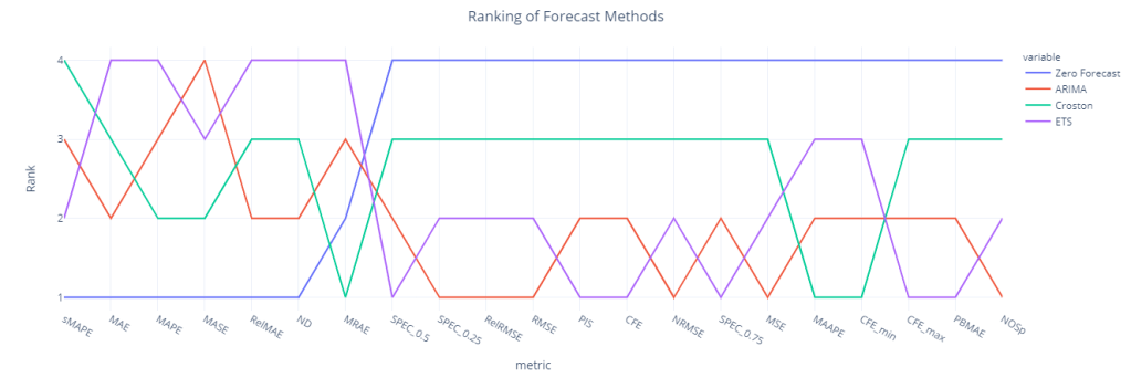
We can see sMAPE, RelMAE, MAE, MAPE, MASE and ND(which is the volume weighted MAPE), all favors zero forecast and ranks it the best forecasting method. But when we look at the inventory related metrics(like CFE, PIS etc. which measure systematic bias in the forecast), Zero Forecast is the worst performing.
MASE, which was supposed to perform better in Intermittent Demand also falls flat and rates the Zero Forecast the best. The danger with choosing a forecasting methodology based on these measures is that we end up forecasting way loo low and that will wreak havoc in the downstream planning tasks.
Surprisingly, ETS and ARIMA fares quite well(over Croston) and ranks 1st and 2nd when we look at the metrics like PIS, MSE, CFE, NOSp etc.
Croston fares well only when we look at MAAPE, MRAE, and CFE_min.
Rank Correlation (Aggregate)
We have ranked the different forecast methods based on all these different metrics. And if a set of metrics are measuring the same thing, then these rankings would also show good correlation. So let’s calculate the Spearman’s Rank correlation for these ranks and see which metrics agree with each other.
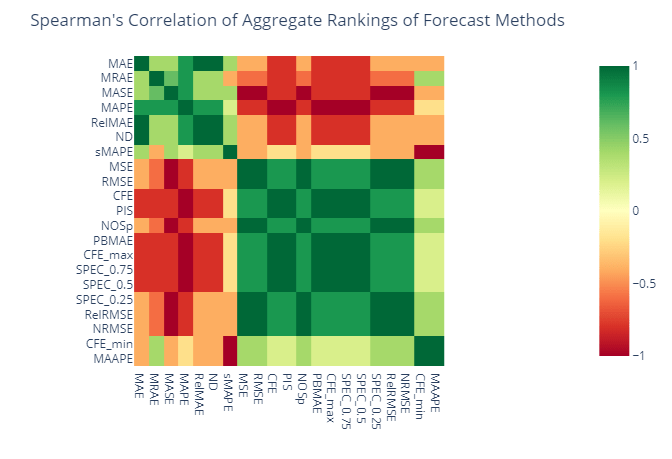
We can see two large groups of metrics which are positively correlated among each other and negatively correlated between groups. MAE, MRAE, MASE, MAPE, RelMAPE, ND, and sMAPE falls into a group and MSE, RMSE, CFE, PIS, SPEC_0.75, SPEC_0.5, SPEC_0.25, NOSp, PBMAE, RelRMSE, and NRMSE in the other. MAAPE and CFE_min fall into the second group as well, but lightly correlated.
Are these two groups measuring different characteristics of the forecast?
Ranking Correlation(Item Level)
Let’s look at the same agreement between metrics at an item level now, instead of the aggregate one. For eg. for each item that we are forecasting we rank the forecasting methods based on these different metrics and run a Spearman’s Rank Correlation on those ranks.
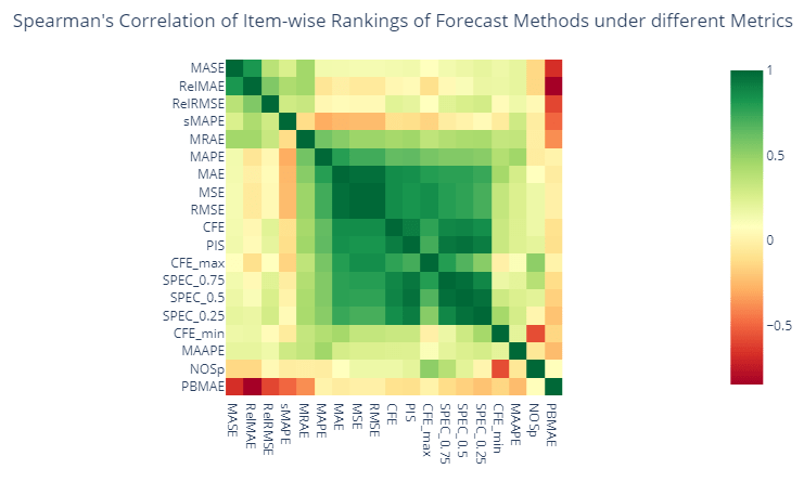
Similar to the aggregate level view, here also we can find two groups of metrics, but contrary to the aggregate level, we cannot find a strong negative correlation across two groups. SPEC_0.5(where we give equal weightage to both opportunity cost and stock keeping cost) and PIS shows a high correlation, mostly because it is conceptually the same.
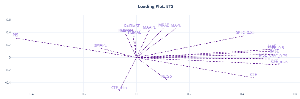
Loading Plots
Another way to visualize and understand the similarity of different metrics is to use the item level metrics and run a PCA with two dimensions. And plot the direction of the original features which point towards the two components we have extracted using PCA. It shows how the original variables contribute to creating the principal component. So if we assume the two PCA components are the main “attributes” that we measure when we talk about “accuracy” of a forecast, the Loading Plot shows you how these different features(metrics) contribute to it, both magnitude and direction wise.
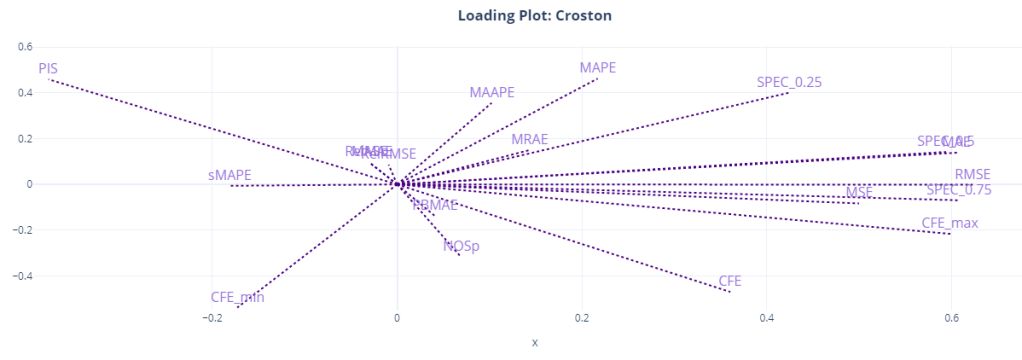
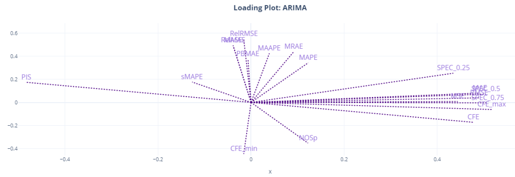
Here, we can see the relationship more crystalized. Most of the metrics are clustered together around the two components. MAE, MSE, RMSE, CFE, CFE_max, and the SPEC metrics all occupy similar space in the loading plot, and it looks like it is the component for “forecast bias” as CFE and SPEC metrics dominate this component. PIS is on the other side, almost at 180 degrees to CFE, because of the sign of PIS.
The other component might be the “accuracy” component. This is dominated by RelRMSE, MASE, MAAPE, MRAE etc. MAPE seems to straddle between the two components, and so is MAAPE.
We can also see that sMAPE might be measuring something totally different, like NOSp and CFE_min.
PIS is at a 180 degrees from CFE, SPEC_0.5, and SPEC_0.75 because of the sign, but they are measuring the same thing. SPEC_0.25(where we give 0.25 weight to opportunity cost) shows more similarity to the other group, probably because it favors under forecasting because of the heavy penalty on stock keeping costs.
Conclusion and Recommendations
We’ve not done a lot of experiments in this short blog post(not as much as Peter Wallström’s thesis[1]), but whatever we have done have shown us quite a bit already. We know not to rely on metrics like sMAPE, RelMAE, MAE, MAPE, MASE because they were giving a zero forecast the best ranking. We also know that there is no single metric that would tell you the whole story. If we look at something like MAPE, we are not measuring the structural bias in the forecast. And if we just look at CFE, it might show a rosy picture, when it is not the case.
Let me quickly summarize the findings from Peter Wallström’s thesis(along with a few of my own conclusions.
- MSE and CFE, even though it appears in the same place in the loading plots, does not show that relationship consistently across different forecasting methods. The same we can see in our loading plots as well. CFE is away from the second component for Croston and ETS.
- MAE and MSE are strongly related and they measure the same variability. And since MAE has shown an affinity to zero forecast, it is preferable to use MSE based error metrics.
- CFE on its own is not very reliable to measure Forecast Bias. And it should be paired with metrics like PIS or SPEC to have a complete picture. CFE can conceal the bias tendency when a time in point is considered. If the CFE value is low in absolute terms the sign do not reveal any bias information. A positive CFE (underestimating) might just be a random figure for a method that is overestimating the demand when the other measures are checked. The low CFE is the result of fulfilling the demand afterwards the demand has occurred which is not traceable by CFE.
- Peter also recommends not to use CFE_max and CFE_min in favor of metrics like PIS and NOSp.
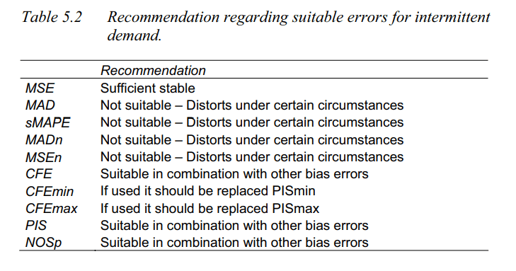
- Apart from these, SPEC scores and MAAPE(which were not reviewed in the thesis) are also suitable measures.
GitHub Repository – https://github.com/manujosephv/forecast_metrics
Checkout the rest of the articles in the series
- Forecast Error Measures: Understanding them through experiments
- Forecast Error Measures: Scaled, Relative, and other Errors
- Forecast Error Measures: Intermittent Demand
References
- Peter Wallström, 2009, Evaluation of Forecasting Techniques and Forecast Errors with a focus on Intermittent Demand
- Kim et al., 2016. A new metric of absolute percentage error for intermittent demand forecasts
- Davidenko & Fildes. 2013, Measuring Forecast Accuracy: The Case Of Judgmental Adjustments To Sku-Level Demand Forecasts
- Martin et al. 2013, A New Metric for Lumpy and Intermittent Demand Forecasts: Stock-keeping-oriented Prediction Error Costs

Martin et al. 2020 not 2013.
LikeLike