
Measurement is the first step that leads to control and eventually improvement.
H. James Harrington
In many business applications, the ability to plan ahead is paramount and in a majority of such scenario we use forecasts to help us plan ahead. For eg., If I run a retail store, how many boxes of that shampoo should I order today? Look at the Forecast. Will I achieve my financial targets by the end of the year? Let’s forecast and make adjustments if necessary. If I run a bike rental firm, how many bikes do I need to keep at a metro station tomorrow at 4pm?
If for all of these scenarios, we are taking actions based on the forecast, we should also have an idea about how good those forecasts are. In classical statistics or machine learning, we have a few general loss functions, like the squared error or the absolute error. But because of the way Time Series Forecasting has evolved, there are a lot more ways to assess your performance.
In this blog post, let’s explore the different Forecast Error measures through experiments and understand the drawbacks and advantages of each of them.
Metrics in Time Series Forecasting
There are a few key points which makes the metrics in Time Series Forecasting stand out from the regular metrics in Machine Learning.
1. Temporal Relevance
As the name suggests, Time Series Forecasting have the temporal aspect built into it and there are metrics like Cumulative Forecast Error or Forecast Bias which takes this temporal aspect as well.
2. Aggregate Metrics
In most business use-cases, we would not be forecasting a single time series, rather a set of time series, related or unrelated. And the higher management would not want to look at each of these time series individually, but rather an aggregate measure which tells them directionally how well we are doing the forecasting job. Even for practitioners, this aggregate measure helps them to get an overall sense of the progress they make in modelling.
3. Over or Under Forecasting
Another key aspect in forecasting is the concept of over and under forecasting. We would not want the forecasting model to have structural biases which always over or under forecasts. And to combat these, we would want metrics which doesn’t favor either over-forecasting or under-forecasting.
4. Interpretability
The final aspect is interpretability. Because these metrics are also used by non-analytics business functions, it needs to be interpretable.
Because of these different use cases, there are a lot of metrics that is used in this space and here we try to unify it under some structure and also critically examine them.
Taxonomy of Forecast Metrics
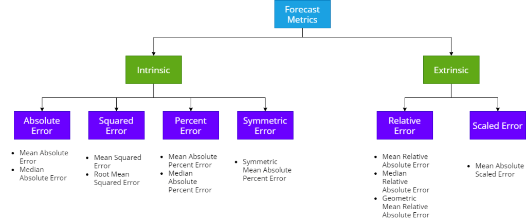
We can classify the different forecast metrics. broadly,. into two buckets – Intrinsic and Extrinsic. Intrinsic measures are the measures which just take the generated forecast and ground truth to compute the metric. Extrinsic measures are measures which use an external reference forecast also in addition to the generated forecast and ground truth to compute the metric.
Let’s stick with the intrinsic measures for now(Extrinsic ones require a whole different take on these metrics). There are four major ways in which we calculate errors – Absolute Error, Squared Error, Percent Error and Symmetric Error. All the metrics that come under these are just different aggregations of these fundamental errors. So, without loss of generality, we can discuss about these broad sections and they would apply to all the metrics under these heads as well.
Absolute Error
This group of error measurement uses the absolute value of the error as the foundation.

Squared Error
Instead of taking the absolute, we square the errors to make it positive, and this is the foundation for these metrics.

Percent Error
In this group of error measurement, we scale the absolute error by the ground truth to convert it into a percentage term.

Symmetric Error
Symmetric Error was proposed as an alternative to Percent Error, where we take the average of forecast and ground truth as the base on which to scale the absolute error.

Experiments
Instead of just saying that these are the drawbacks and advantages of such and such metrics, let’s design a few experiments and see for ourselves what those advantages and disadvantages are.
Scale Dependency
In this experiment, we try and figure out the impact of the scale of timeseries in aggregated measures. For this experiment, we
- Generate 10000 synthetic time series at different scales, but with same error.
- Split these series into 10 histogram bins
- Sample Size = 5000; Iterate over each bin
- Sample 50% from current bin and res, equally distributed, from other bins.
- Calculate the aggregate measures on this set of time series
- Record against the bin lower edge
- Plot the aggregate measures against the bin edges.
Symmetricity
The error measure should be symmetric to the inputs, i.e. Forecast and Ground Truth. If we interchange the forecast and actuals, ideally the error metric should return the same value.
To test this, let’s make a grid of 0 to 10 for both actuals and forecast and calculate the error metrics on that grid.
Complementary Pairs
In this experiment, we take complementary pairs of ground truths and forecasts which add up to a constant quantity and measure the performance at each point. Specifically, we use the same setup as we did the Symmetricity experiment, and calculate the points along the cross diagonal where ground truth + forecast always adds up to 10.
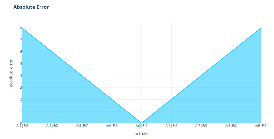
Loss Curves
Our metrics depend on two entities – forecast and ground truth. We can fix one and vary the other one using a symmetric range of errors((for eg. -10 to 10), then we expect the metric to behave the same way on both sides of that range. In our experiment, we chose to fix the Ground Truth because in reality, that is the fixed quantity, and we are measure the forecast against ground truth.
Over & Under Forecasting Experiment
In this experiment we generate 4 random time series – ground truth, baseline forecast, low forecast and high forecast. These are just random numbers generated within a range. Ground Truth and Baseline Forecast are random numbers generated between 2 and 4. Low forecast is a random number generated between 0 and 3 and High Forecast is a random number generated between 3 and 6. In this setup, the Baseline Forecast should act as a baseline for us, Low Forecast is a forecast where we continuously under-forecast, and High Forecast is a forecast where we continuously over-forecast. And now let’s calculate the MAPE for these three forecasts and repeat the experiment for 1000 times.

Outlier Impact
To check the impact on outliers, we setup the below experiment.
We want to check the relative impact of outliers on two axes – number of outliers, scale of outliers. So we define a grid – number of outliers [0%-40%] and scale of outliers [0 to 2]. Then we picked a synthetic time series at random, and iteratively introduced outliers according to the parameters of the grid we defined earlier and recorded the error measures.
Results and Discussion
Absolute Error
Symmetricity
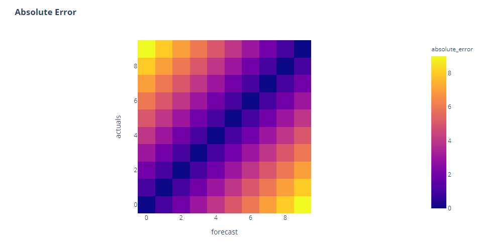
That’s a nice symmetric heatmap. We see zero errors along the diagonal, and higher errors spanning away from it in a nice symmetric pattern.
Loss Curves

Again symmetric. MAE varies equally if we go on both sides of the curve.
Complementary Pairs
Again good news. If we vary forecast, keeping actuals constant, and vice versa the variation in the metric is also symmetric.
Over and Under Forecasting
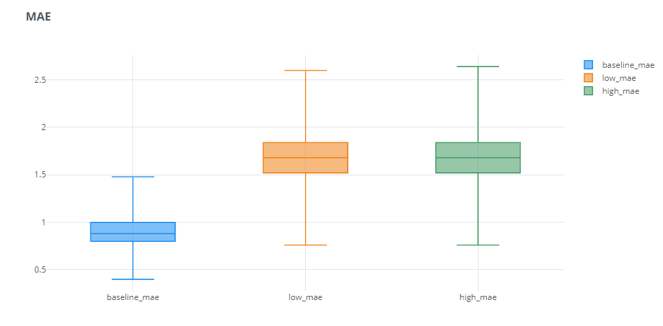
As expected, over or under forecasting doesn’t make much of a difference in MAE. Both are equally penalized.
Scale Dependency
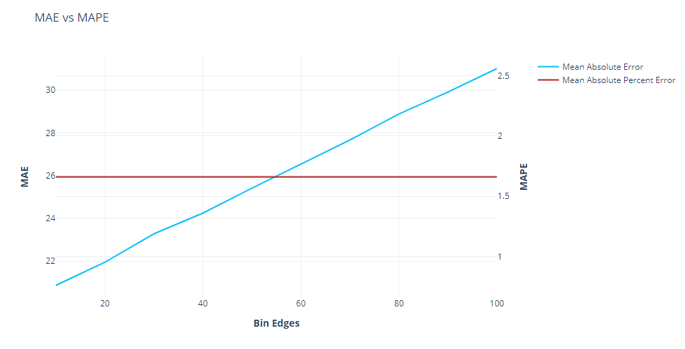
This is the Achilles heel of MAE. here, as we increase the base level of the time-series, we can see that the MAE increases linearly. This means that when we are comparing performances across timeseries, this is not the measure you want to use. For eg., when comparing two timeseries, one with a level of 5 and another with a level of 100, using MAE would always assign a higher error to the timeseries with level 100. Another example is when you want to compare different sub-sections of your set of timeseries to see where the error is higher(for eg. different product categories, etc.), then using MAE would always tell you that the sub-section which has a higher average sales would also have a higher MAE, but that doesn’t mean that sub-section is not doing well.
Squared Error
Symmetricity
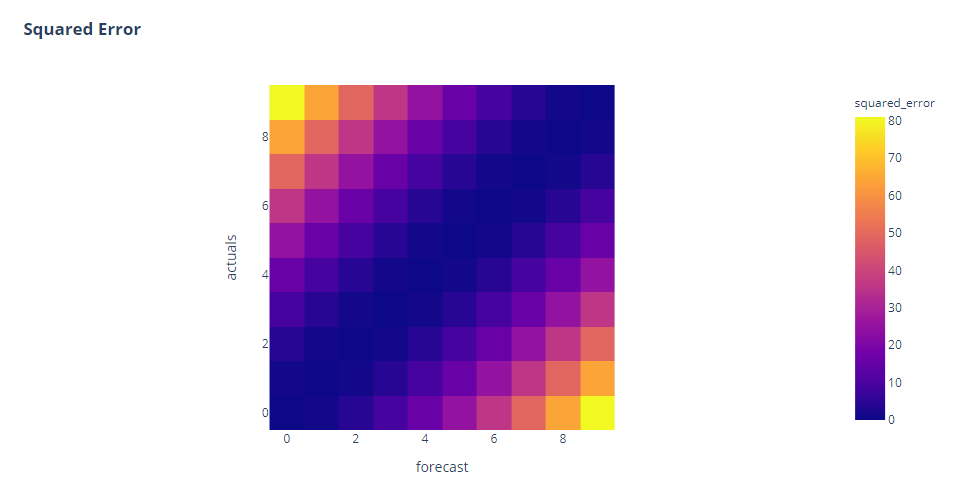
Squared Error also shows the symmetry we are looking for. But one additional point we can see here is that the errors are skewed towards higher errors. The distribution of color from the diagonal is not as uniform as we saw in Absolute Error. This is because the squared error(because of the square term), assigns higher impact to higher errors that lower errors. This is also why Squared Errors are, typically, more prone to distortion due to outliers.
Side Note: Since squared error and absolute error are also used as loss functions in many machine learning algorithms, this also has the implications on the training of such algorithms. If we choose squared error loss, we are less sensitive to smaller errors and more to higher ones. And if we choose absolute error, we penalize higher and lower errors equally and therefore a single outlier will not influence the total loss that much.
Loss Curves

We can see the same pattern here as well. It is symmetric around the origin, but because of the quadratic form, higher errors are having disproportionately more error as compared to lower ones.
Complementary Pairs

Over and Under Forecasting
Similar to MAE, because of the symmetry, Over and Under Forecasting has pretty much the same impact.
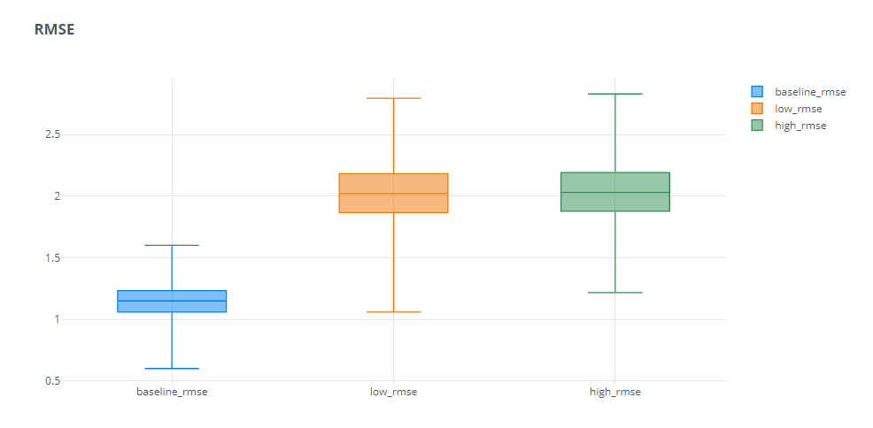
Scale Dependency
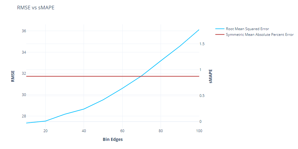
Similar to MAE, RMSE also has the scale dependency problem, which means that all the disadvantages we discussed for MAE, applied here as well, but worse. We can see that RMSE scales quadratically when we increase the scale.
Percent Error
Percent Error is the most popular error measure used in the industry. A couple of reasons why it is hugely popular are:
- Scale Independent – As we saw in the scale dependency plots earlier, the MAPE line is flat as we increase the scale of the timeseries.
- Interpretability – Since the error is represented as a percentage term, which is quite popular and interpretable, the error measure also instantly becomes interpretable. If we say the RMSE is 32, it doesn’t mean anything in isolation. But on the other hand, if we say the MAPE is 20%, we instantly know ho good or bad the forecast is.
Symmetricity
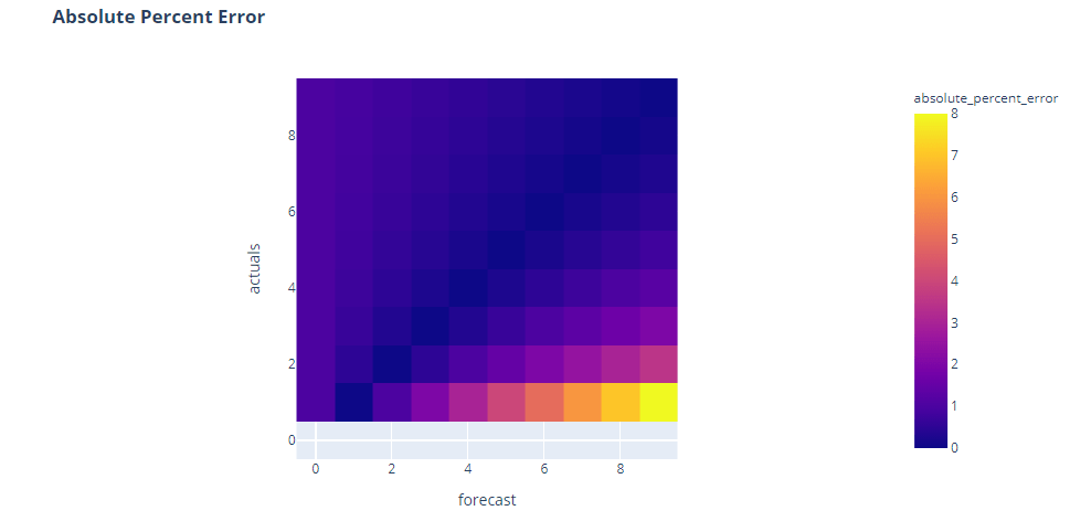
Now that doesn’t look right, does it? Percent Error, the most popular of them all, doesn’t look symmetric at all. In fact, we can see that the errors peak when actuals is close to zero and tending to infinity when actuals is zero(the colorless band at the bottom is where the error is infinity because of division by zero).
We can see two shortcomings of the percent error here:
- It is undefined when ground truth is zero(because of division by zero)
- It assigns higher error when ground truth value is lower(top right corner)
Let’s look at the Loss Curves and Complementary Pairs plots to understand more.
Loss Curves
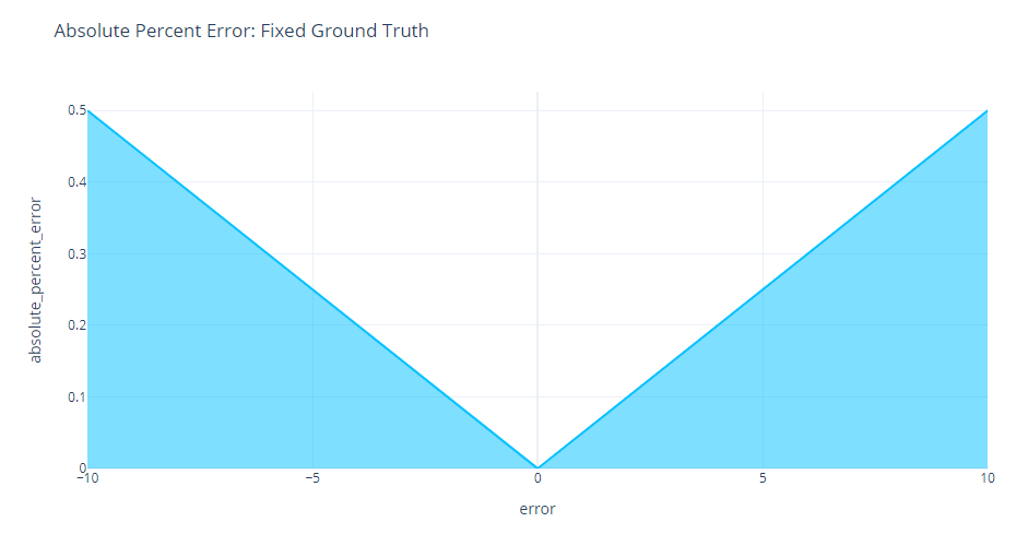
Suddenly, the asymmetry we are seeing is no more. If we keep the ground truth fixed, Percent Error is symmetric around the origin.
Complementary Pairs
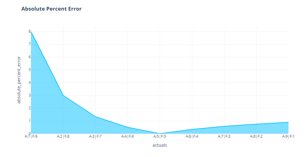
But when we look at complementary pairs, we see the asymmetry we were seeing earlier in the heatmap. When the actuals are low, the same error is having a much higher Percent Error than the same error when the forecast was low.
All of this is because of the base which we take for scaling it. Even if we have the same magnitude of error, if the ground truth is low, the percent error will be high and vice versa. For example, let’s review two cases:
- F = 8, A=2 –> Absolute Percent Error =
- F=2, A=8 –> Absolute Percent Error =


There are countless papers and blogs which claim the asymmetry of percent error to be a deal breaker. The popular claim is that absolute percent error penalizes over-forecasting more than under-forecasting, or in other words, it incentivizes under-forecasting.
One argument against this point is that this asymmetry is only there because we change the ground truth. An error of 6 for a time series which has an expected value of 2 is much more serious than an error of 2 for a time series which has an expected value of 6. So according to that intuition, the percent error is doing what it is supposed to do, isn’t it?
Over and Under Forecasting
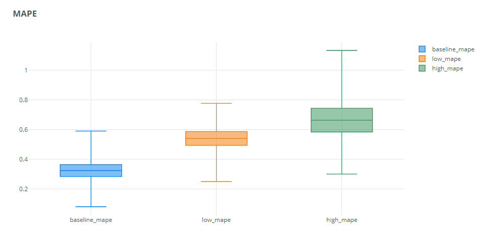
Not exactly. On some levels the criticism of percent error is rightly justified. Here we see that the forecast where we were under-forecasting has a consistently lower MAPE than the ones where we were over-forecasting. The spread of the low MAPE is also considerably lower than the others. But does that mean that the forecast which always predicts on the lower side is the better forecast as far as the business is concerned? Absolutely not. In a Supply Chain, that leads to stock outs, which is not where you want to be if you want to stay competitive in the market.
Symmetric Error
Symmetric Error was proposed as an better alternative to Percent error. There were two key disadvantages for Percent Error – Undefined when Ground Truth is zero and Asymmetry. And Symmetric Error proposed to solve both by using the average of ground truth and forecast as the base over which we calculate the percent error.
Symmetricity
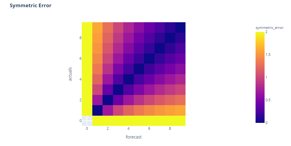
Right off the bat, we can see that this is symmetric around the diagonal, almost similar to Absolute Error in case of symmetry. And the bottom bar which was empty, now has colors(which means they are not undefined). But a closer look reveals something more. It is not symmetric around the second diagonal. We see the errors are higher when both actuals and forecast are low.
Loss Curves
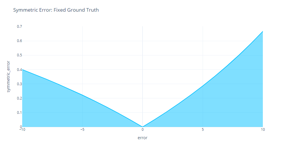
This is further evident in the Loss Curves. We can see the asymmetry as we increase errors on both sides of the origin. And contrary to the name, Symmetric error penalizes under forecasting more than over forecasting.
Complementary Pairs
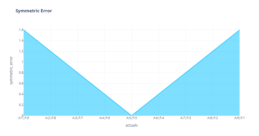
But when we look at complementary pairs, we can see it is perfectly symmetrical. This is probably because of the base, which we are keeping constant.
Over and Under Forecasting

We can see the same here as well. The over forecasting series has a consistently lower error as compared to the under forecasting series. So in the effort to normalize the bias towards under forecasting of Percent Error, Symmetric Error shot the other way and is biased towards over forecasting.
Outlier Impact
In addition to the above experiments, we had also ran an experiment to check the impact of outliers(single predictions which are wildly off) on the aggregate metrics.

All four error measures have similar behavior, when coming to outliers. The number of outliers have a much higher impact than the scale of outliers.
Among the four, RMSE is having the biggest impact from outliers. We can see the contour lines are spaced far apart, showing the rate of change is high when we introduce outliers. On the other end of the spectrum, we have sMAPE which has the least impact from outliers. It is evident from the flat and closely spaced contour lines. MAE and MAPE are behaving almost similarly, probably MAPE a tad bit better.
Summary
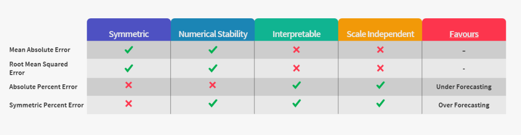
To close off, there is no one metric which satisfies all the desiderata of an error measure. And depending on the use case, we need to pick and choose. Out of the four intrinsic measures( and all its aggregations like MAPE, MAE, etc.), if we are not concerned by Interpretability and Scale Dependency, we should choose Absolute Error Measures(that is also a general statement. there are concerns with Reliability for Absolute and Squared Error Measures). And when we are looking for scale independent measures, Percent Error is the best we have(even with all of it’s short comings). Extrinsic Error measures like Scaled Error offer a much better alternative in such cases(May be in another blog post I’ll cover those as well.)
All the code to recreate the experiments are at my github repository:
https://github.com/manujosephv/forecast_metrics/tree/master
Checkout the rest of the articles in the series
- Forecast Error Measures: Understanding them through experiments
- Forecast Error Measures: Scaled, Relative, and other Errors
- Forecast Error Measures: Intermittent Demand
Featured Image Source
Further Reading
- Shcherbakov et al. 2013, A Survey of Forecast Error Measures
- Goodwin & Lawton, 1999, On the asymmetry of symmetric MAPE
Edited
- Fixed a mislabeling in the Contour Maps

3 thoughts on “Forecast Error Measures: Understanding them through experiments”